


Dec 6, 2023
Digital Design
UI/UX Design

Top 5 Ways UI/UX Updates Fuel Revenue Growth

UX Is a Revenue Lever, Not a Coat of Paint
User interface and user experience decisions show up directly in revenue, and the research is unambiguous about it. Here are five ways UI/UX updates pay for themselves, with the numbers to prove it.
1. Conversion Rate
The Baymard Institute puts average cart abandonment at 69.57%, and the top culprits are complicated checkouts and trust concerns: 13% of users abandon over payment security worries alone.
"25% of users [that abandon] is because the website is too complicated."
- Baymard Institute
A quarter of users quit sites simply because they feel too complicated. Every simplification of the path to purchase converts some of that lost traffic back into buyers, which is why checkout UX is usually the highest-ROI screen in any product.
2. Retention
Acquiring a customer is expensive; keeping one is design work. Users return to products that feel effortless, and regular UX refinement is what keeps them effortless as features pile up. We saw this firsthand building FitRev, where obsessive attention to the daily workout flow earned a 4.8 average rating across app stores and the retention that comes with it.

3. Brand Perception and Trust
Interfaces are how digital brands are judged. A polished, coherent product reads as a competent company, and users extend that trust to their wallets. A confusing one taxes every interaction and quietly erodes the brand equity marketing paid for.
"...businesses that have optimized their mobile check-out processes have seen a 12% increase in conversion rates."
- Statista's Mobile Internet & Apps Report
4. Support Costs
Every question a user cannot answer in the interface becomes a support ticket. Clear hierarchy, honest labels, and obvious next steps cut support volume at the source, which converts directly to margin as you scale.
5. Competitive Separation
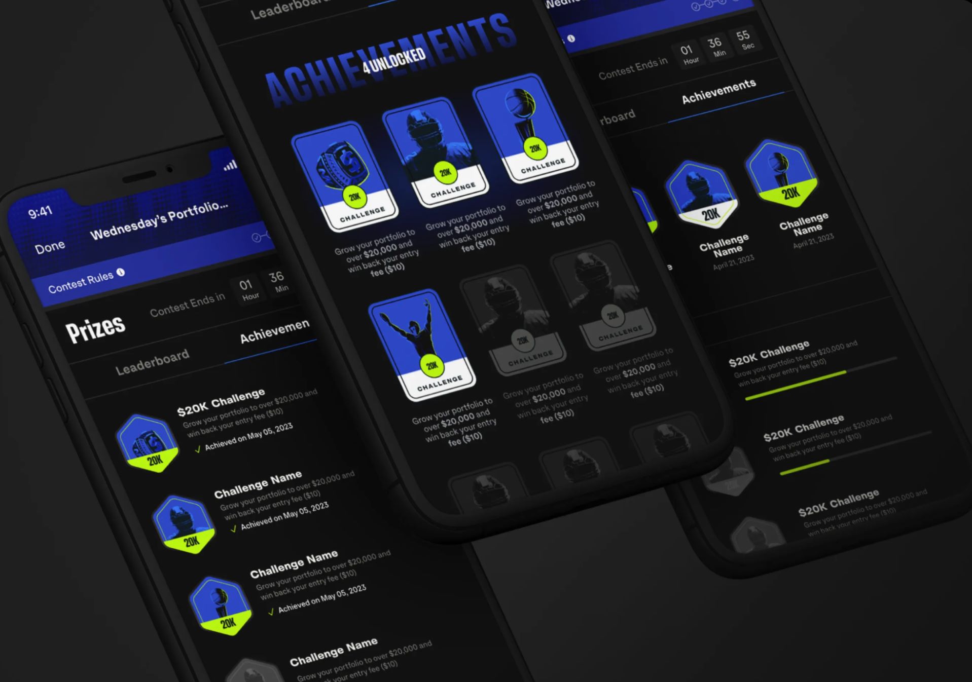
In crowded markets, feature lists converge and experience is what differentiates. The product that feels better wins the comparison, the review, and the referral. That is as true for a sports platform as it is for enterprise software like Square's business banking.
Where to Start
You do not need a ground-up redesign to capture this. Start with the highest-traffic flow, measure it honestly, and fix the friction in order of revenue impact. If you want a team that has done it across fitness, sports, and fintech, get in touch.

